Exploratory Data Analysis (EDA)
You should explore your data before doing anything else

Really get to know them…
We can visualise how a variable

is distributed with a histogram
In histograms

measurements are placed in bins of a certain size
For example, all measurements from 13.79-14.29 are in the first bin
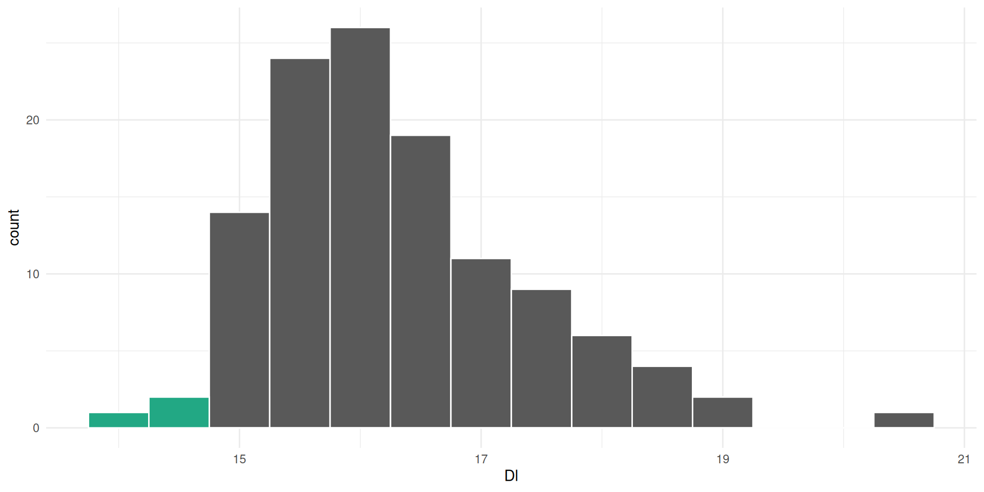
14.29-14.79 are in the second, etc…
The height of the bin is determined by how many observations are placed in the bins
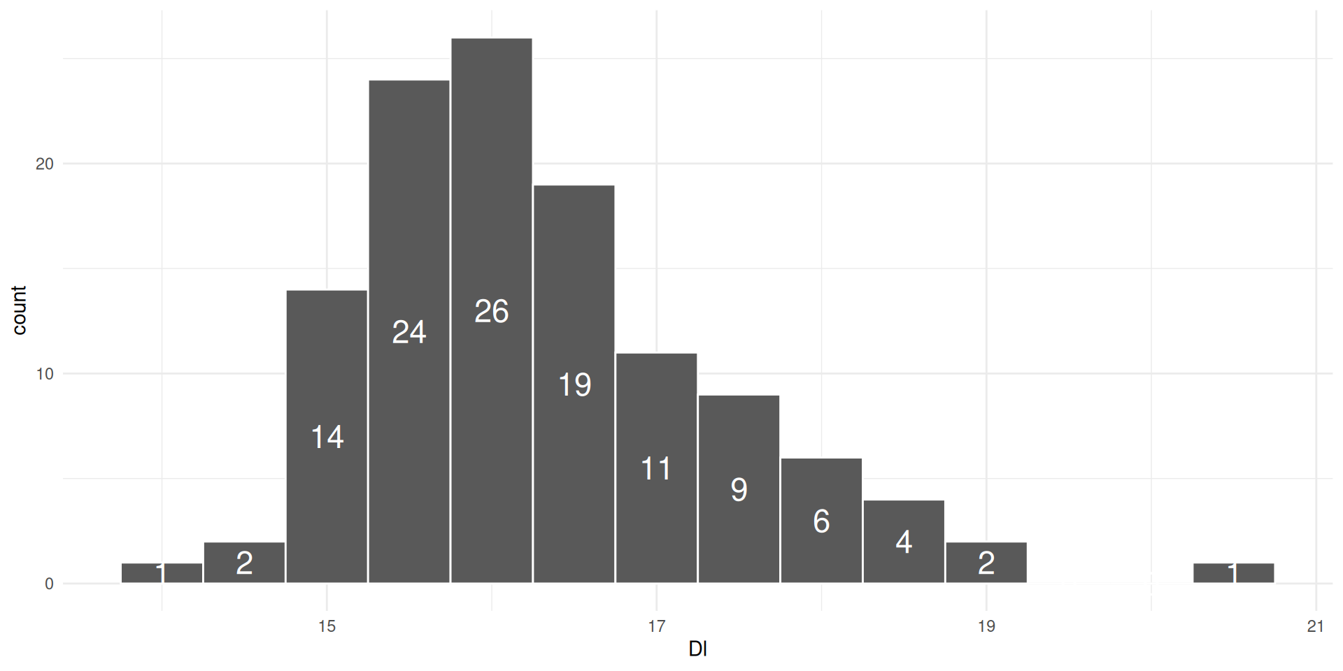
which allows us to see where most observations lie
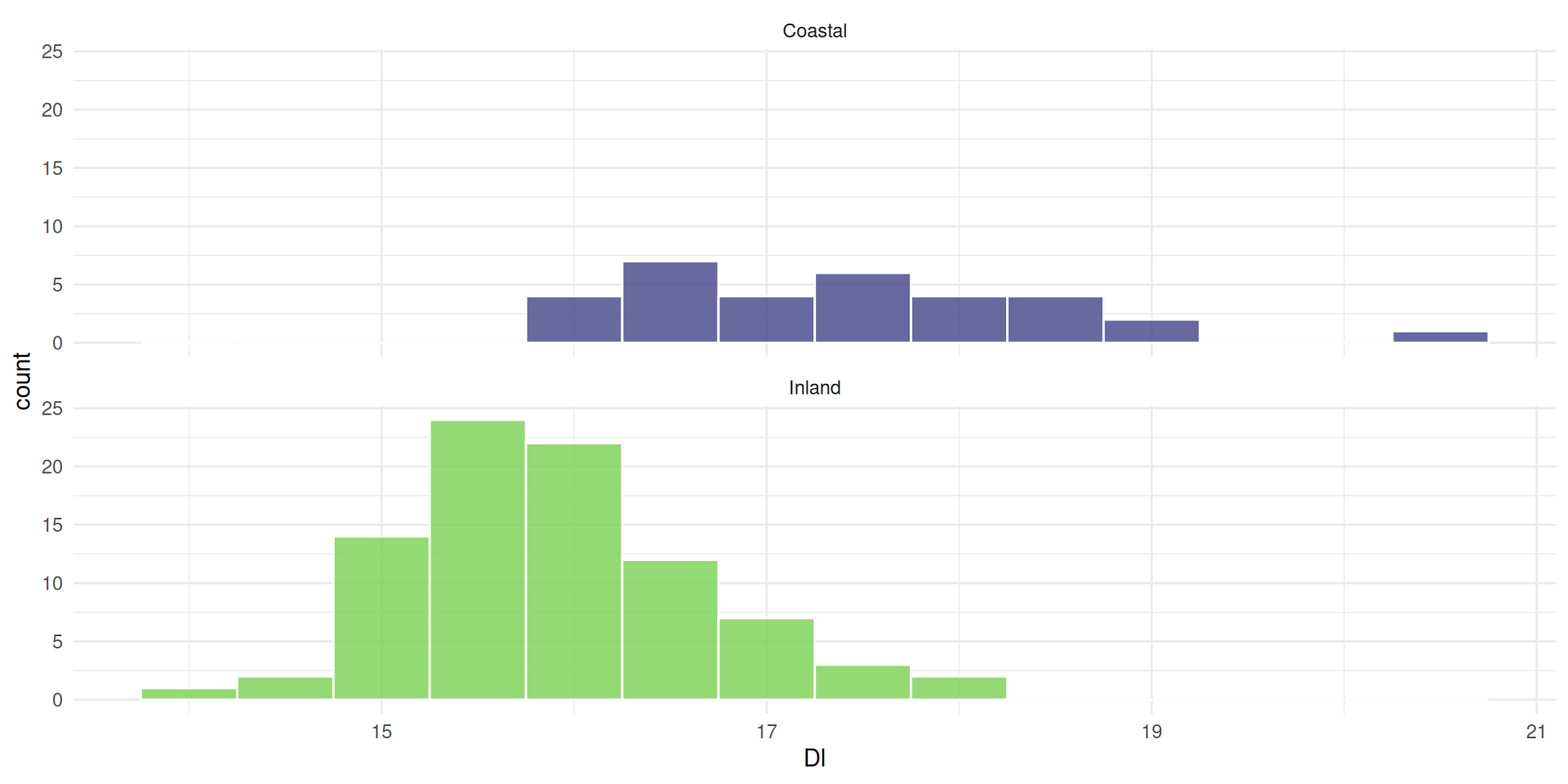
We can also separate the groups
the mean is not always aligned with the most observations

If a distribution is skewed, the mean moves off center
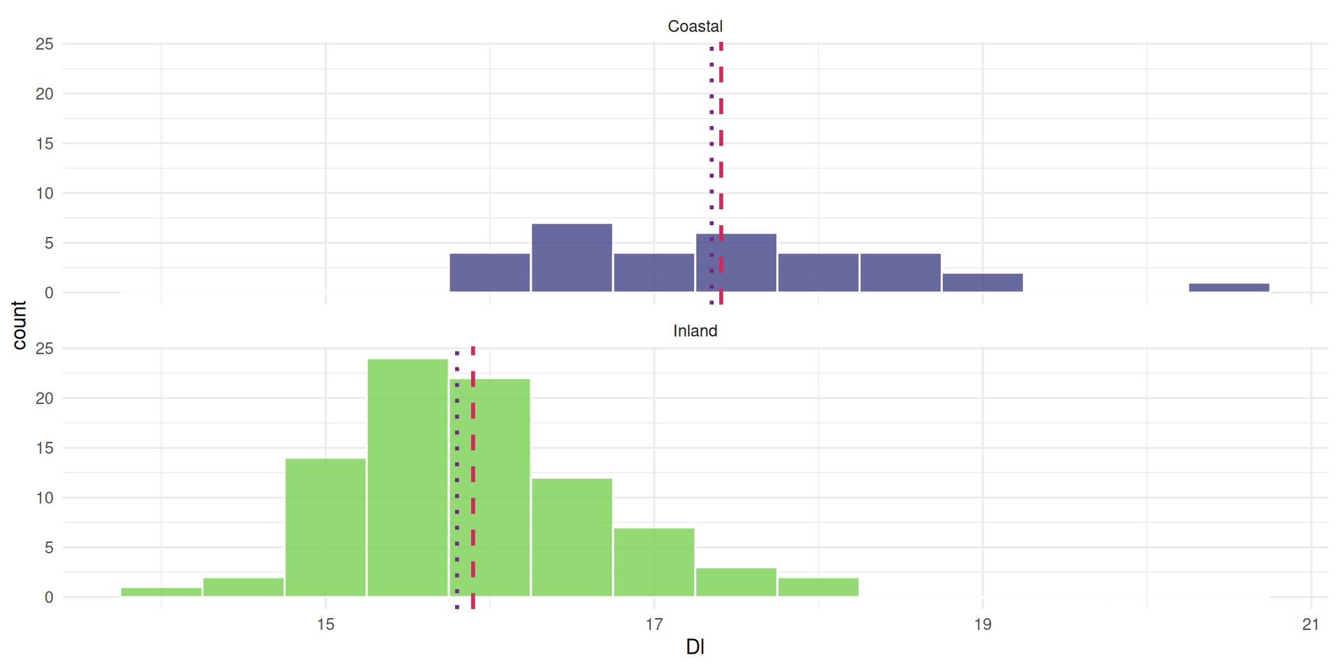
and the median is closer to the most observations
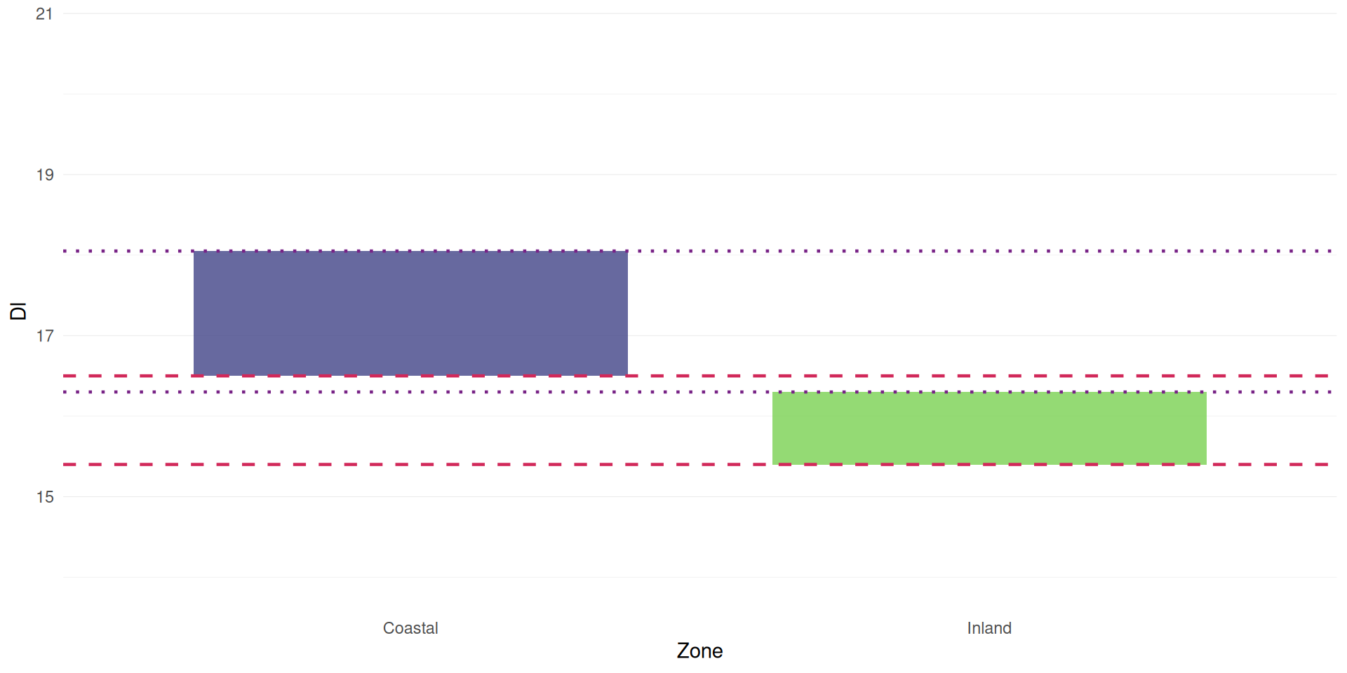
The width of a plot is not a great indicator of dispersion
It’s more of a combination between width and height

Tall and narrow = low dispersion (small variance)
Short and wide = high dispersion (large variance)
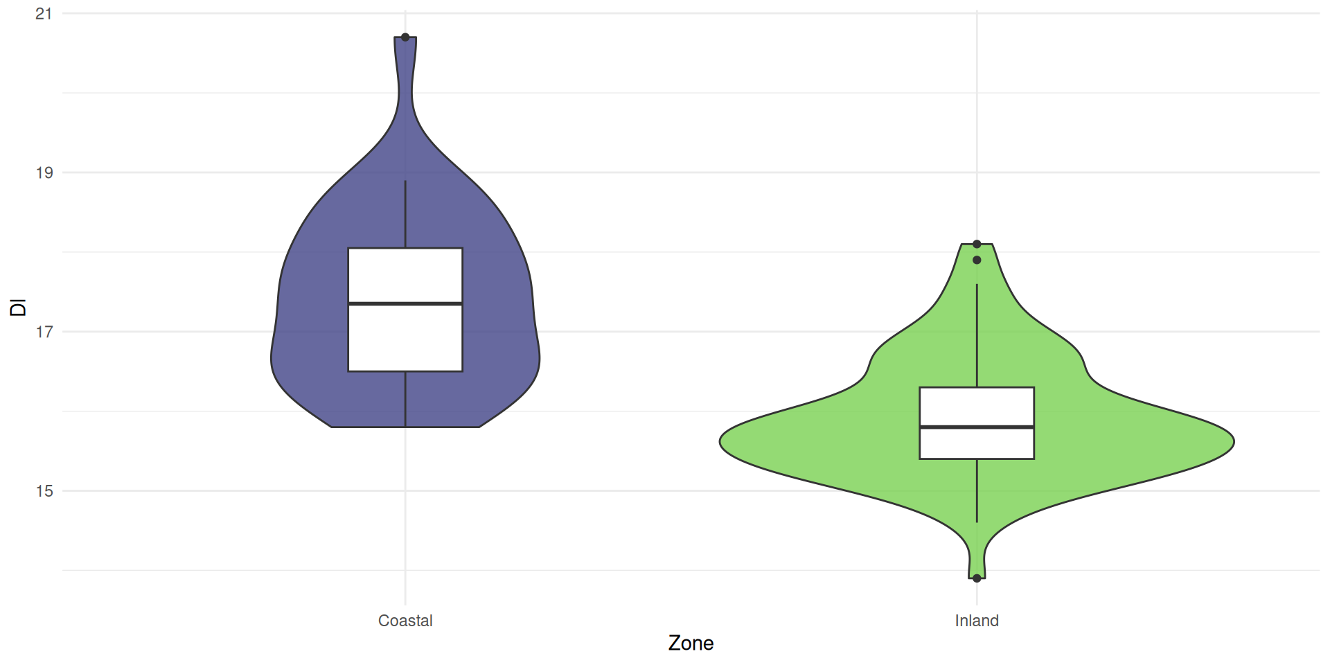
Box plots (a.k.a., box and whiskers)

are a better indicator of dispersion
They give us the quartiles
25% (dashed) and 75% (dotted)
median

whiskers

and outliers
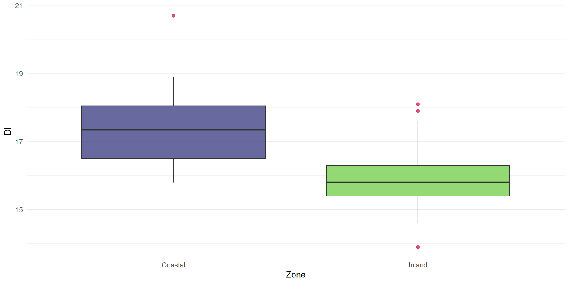
The length of the box is the Inter-Quartile Range (IQR)
calculated as the 75% quartile minus 25% quartile

Length of the whiskers are 1.5 times the IQR
Outliers are points falling outside the whiskers
We could combine with a histogram

or use a violin plot
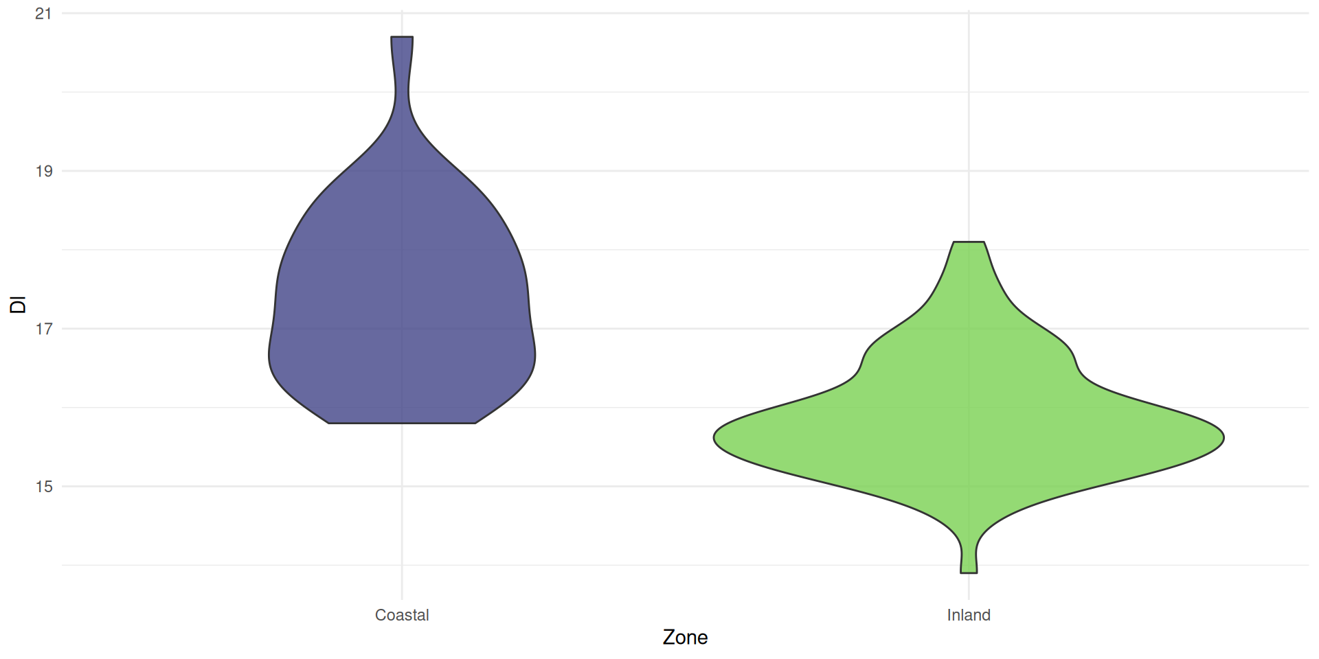
combined with a box plot
Violin plots consist of mirrored density plots
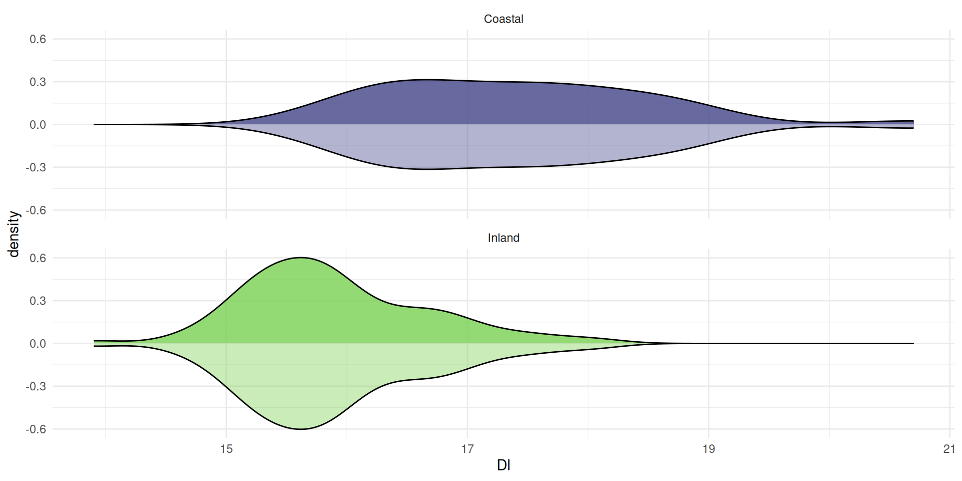
A density plot is a ‘smoothed’ histogram

calculated using a Kernal Density Estimate
The area under the curve is always 1, because the
the probability of all the values cannot exceed 1
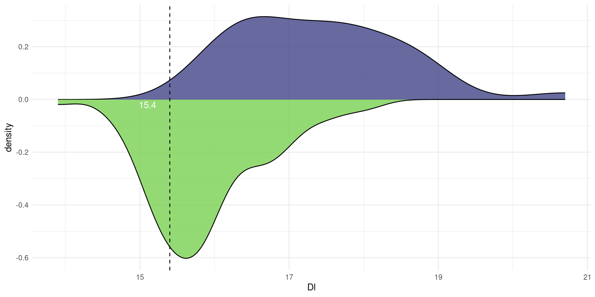
A point on the curve is the estimated probability density
Like bar plots

Which simply show counts of values
Gridlines
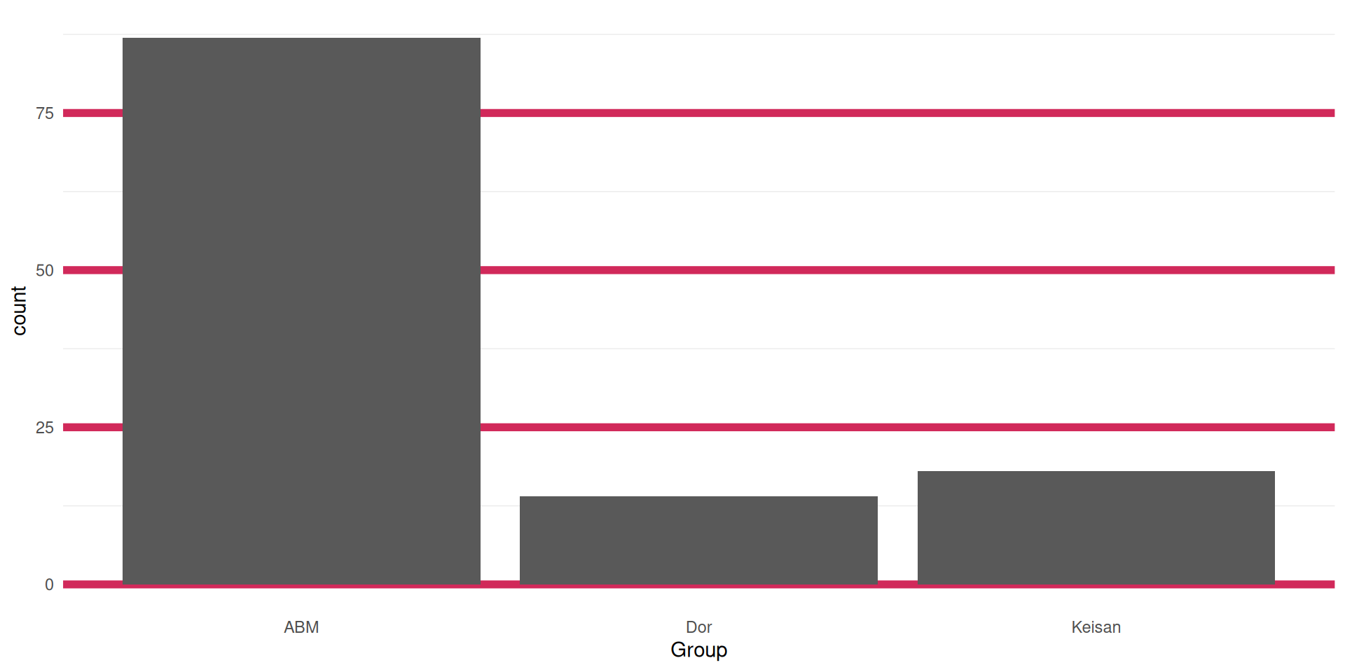
allow readers to see the actual values
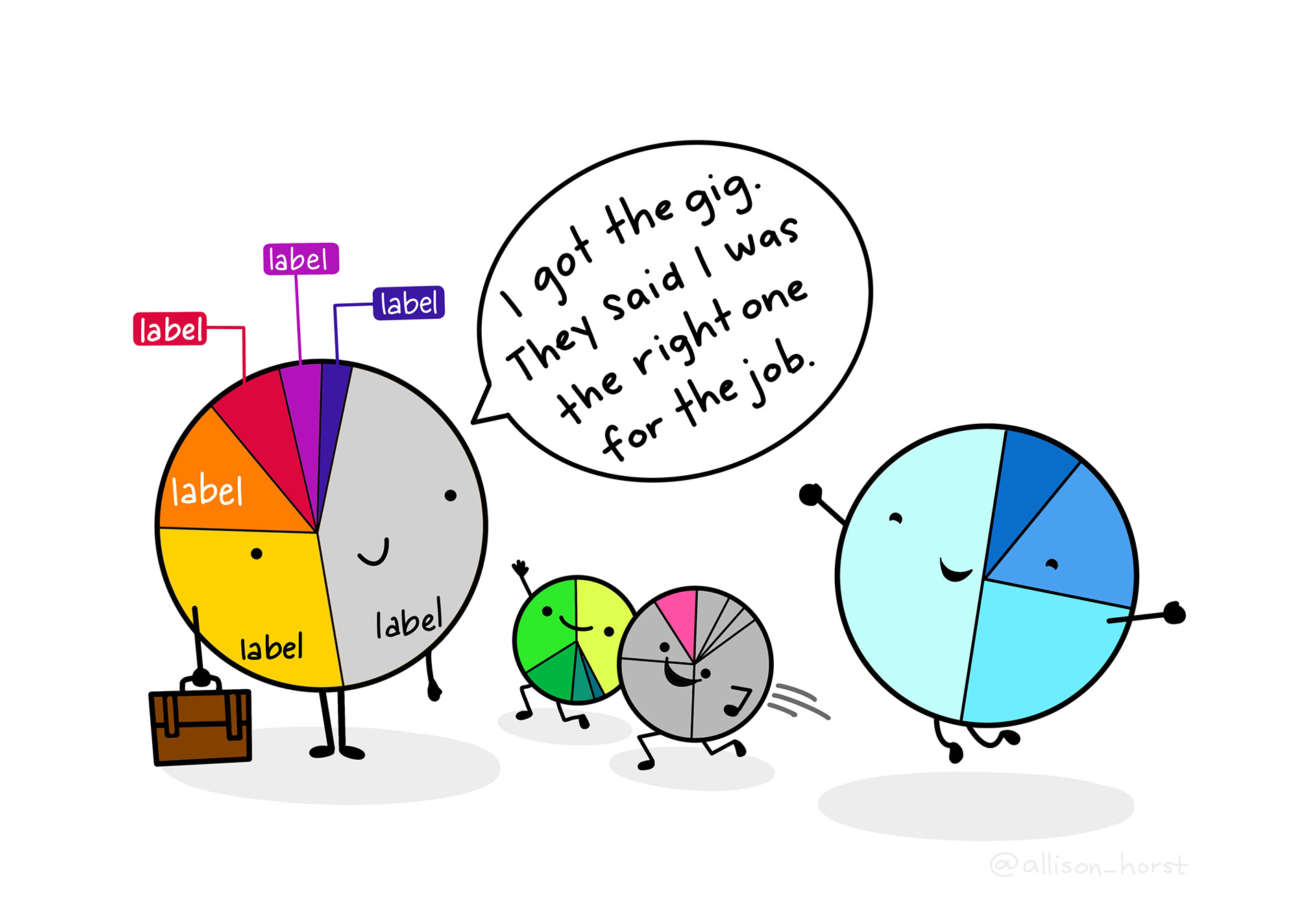
Pie charts can also show this
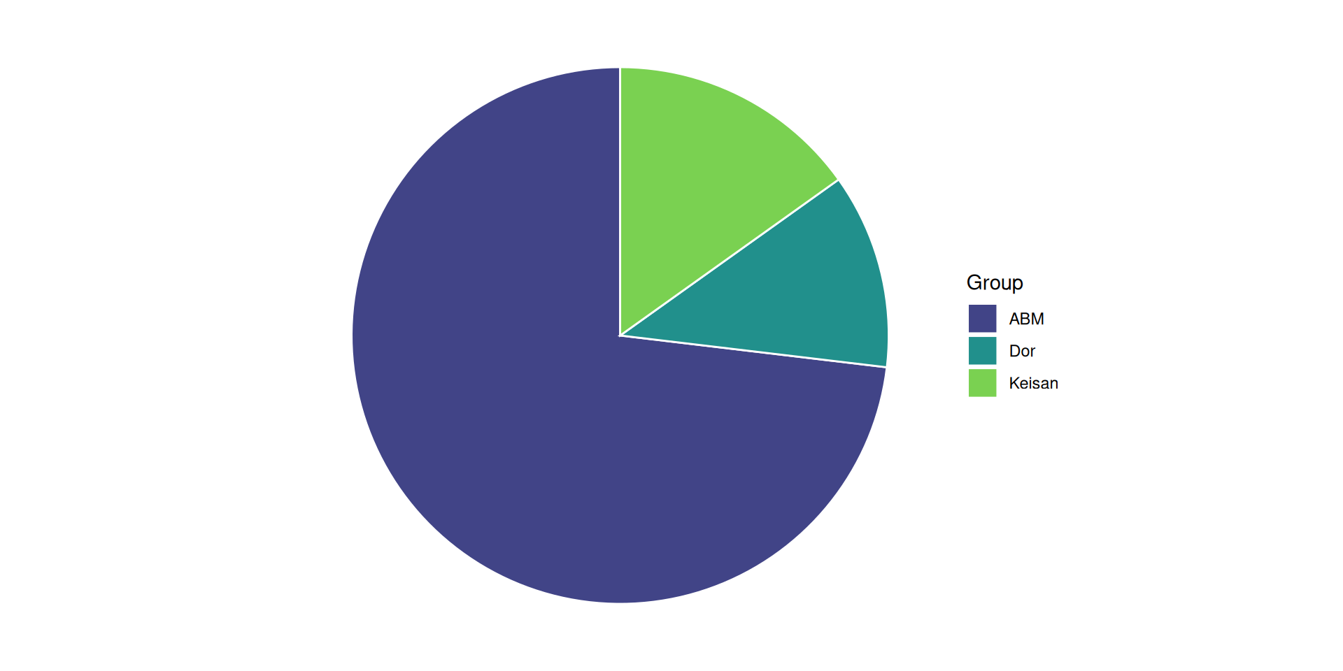
But should be used sparingly…
Pie charts And if you like it
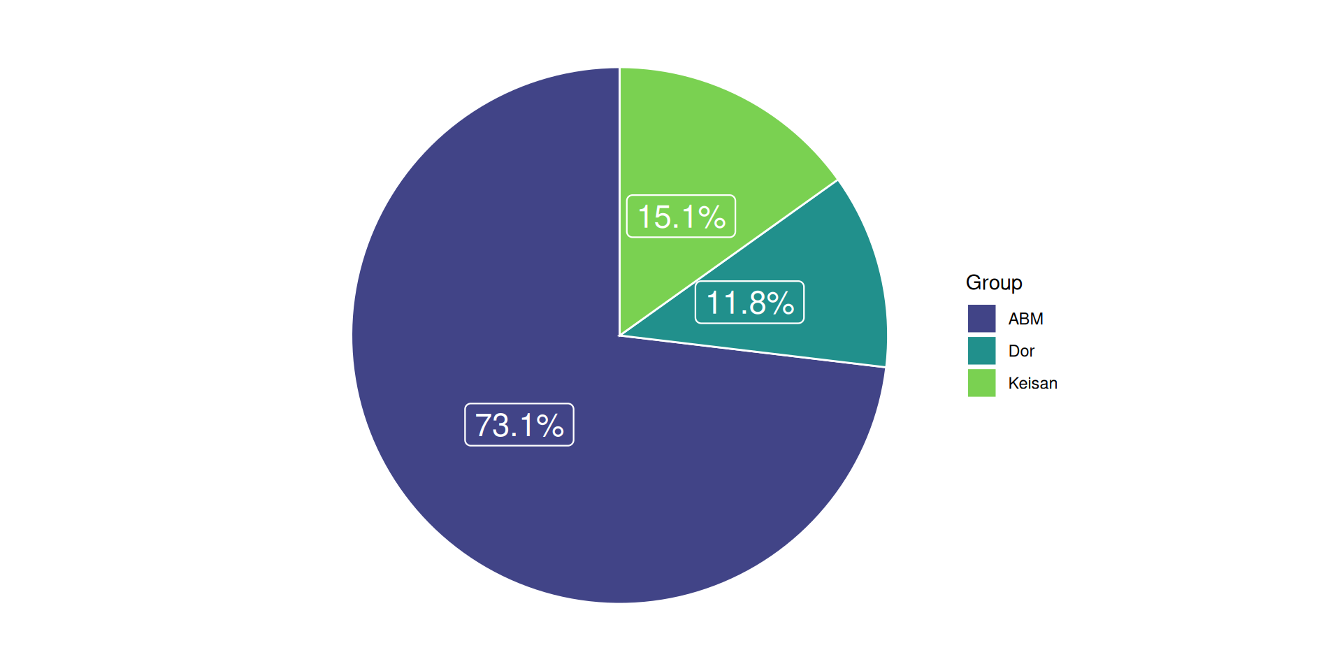
you better put a label on it
Bar plot axes can be rearranged to improve interpretation
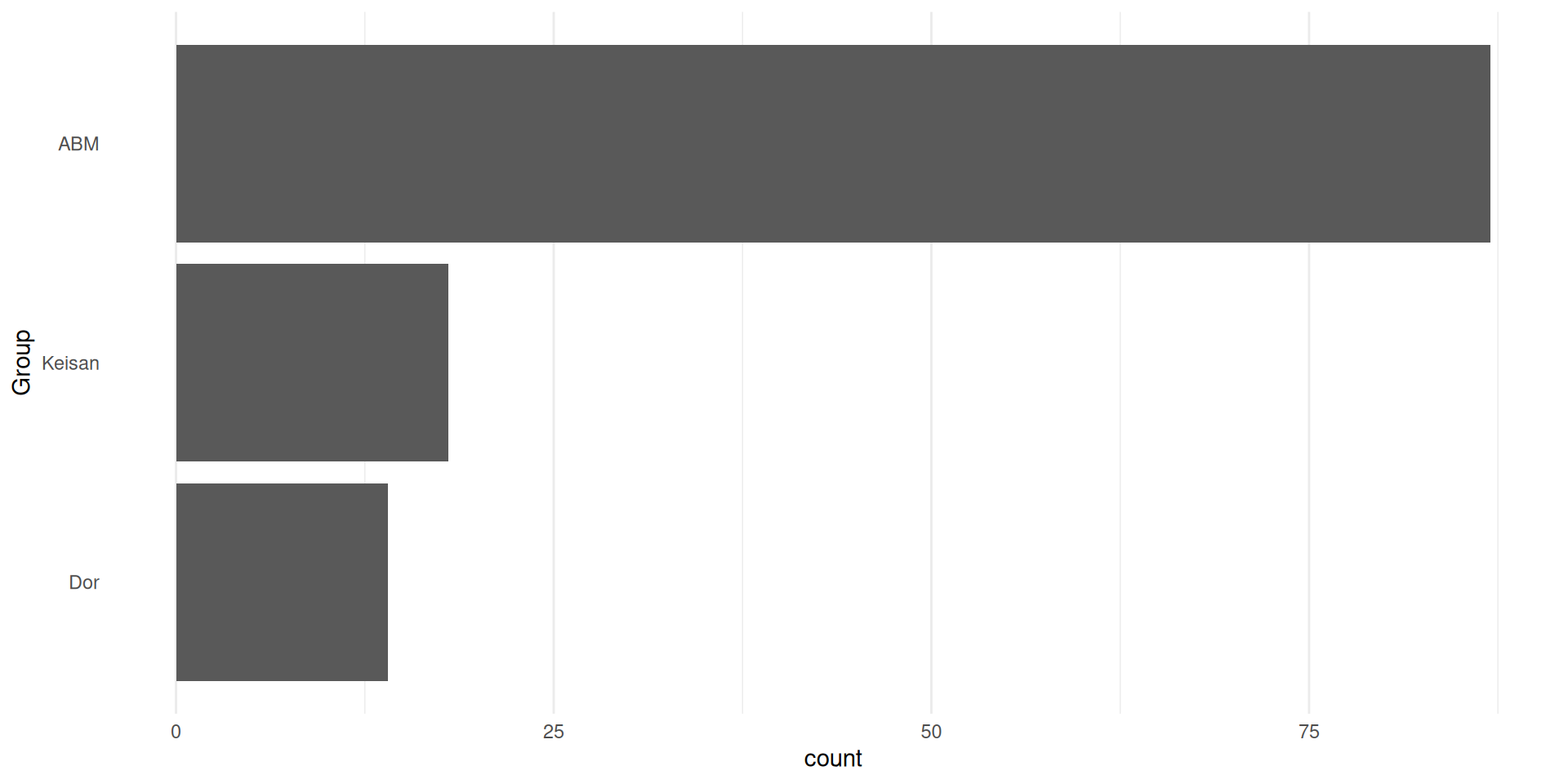
For example, ordered by frequency
Show multiple variables
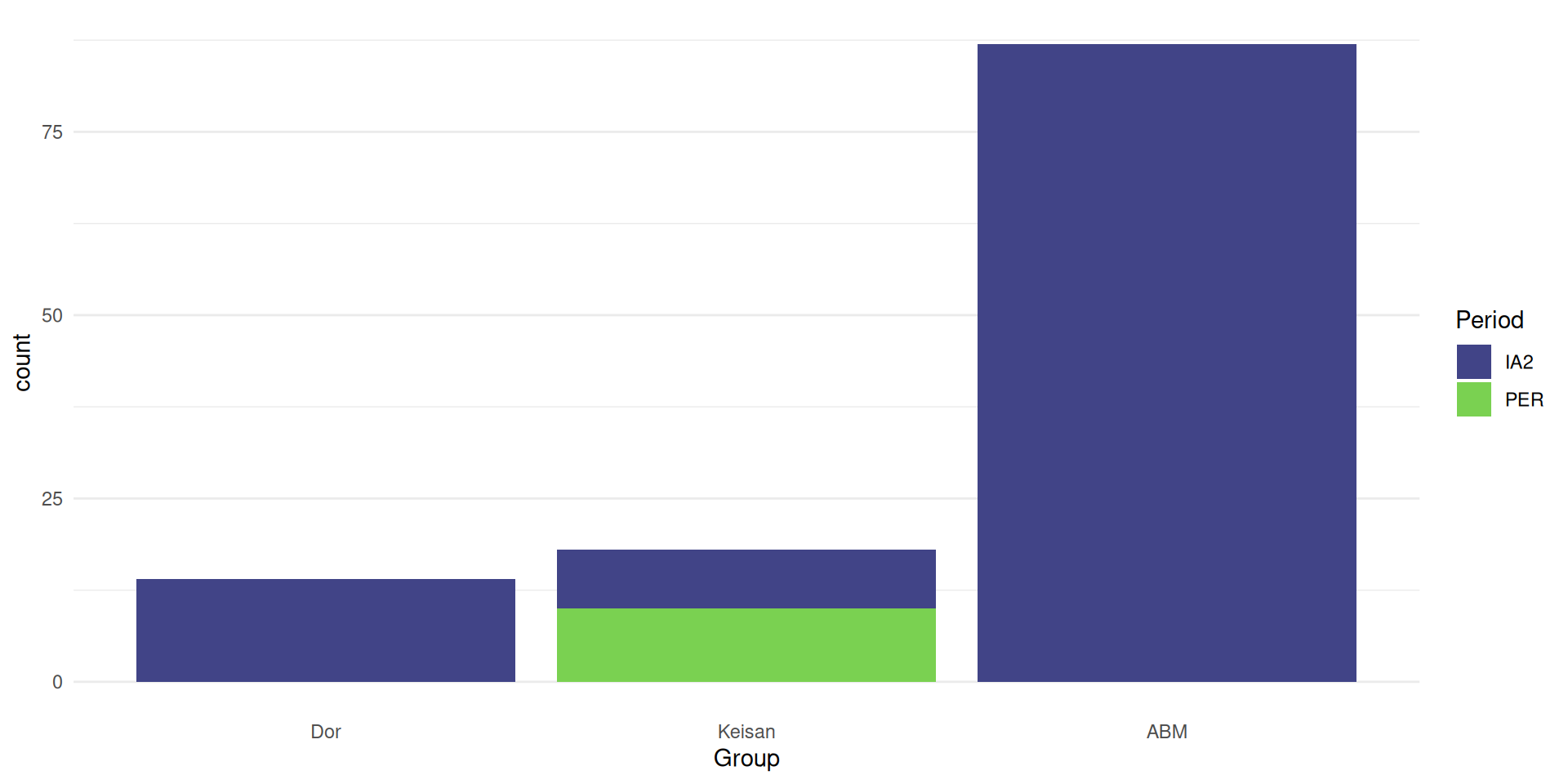
stacked
Show multiple variables
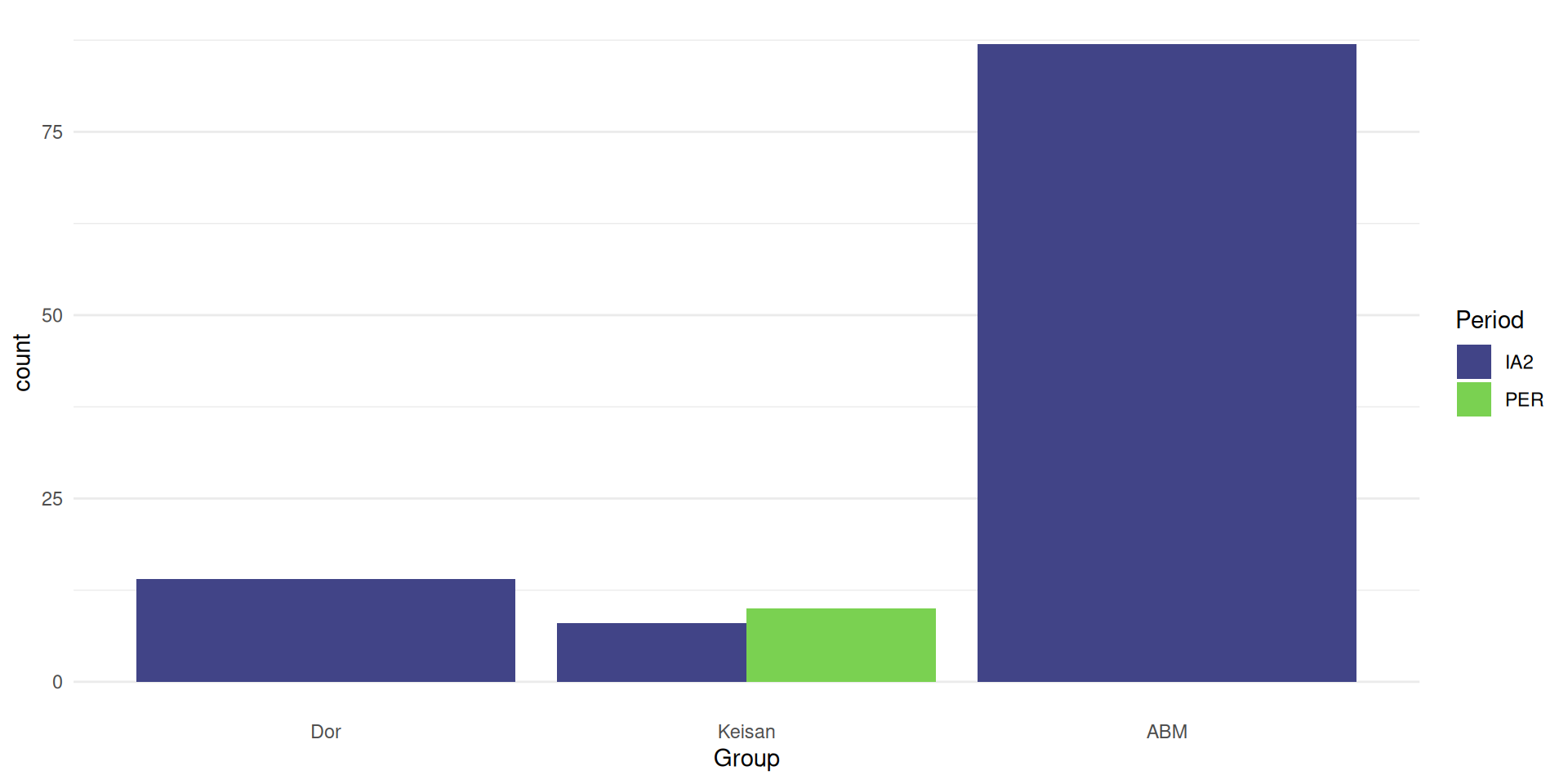
side-by-side
Show multiple variables
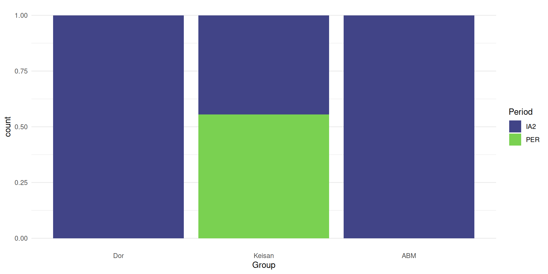
proportional
Tips for data visualistions
LABEL YOUR AXES
Avoid redundant information
Avoid information overload
Figures should be able to stand alone
Keep colour-deficient vision in mind
LABEL YOUR AXES
Royal Statistical Society Data Visualisation Guide
Friends don’t let friends make bad graphs